Sydney Commute Times Mapped Part 2

EDIT 12-03-2025: I accidentially broke the maps when deleting my AWS account, as the mbtiles were hosted there. Oops.

In Sydney Commute Times Mapped Part 1 I took a small step to a bigger goal of mashing together public transport in Sydney, and the Metropolitan Strategy for Sydney to 2031. The question I wanted to answer is this: how aligned is Sydney’s public transport infrastructure and the Metropolitan Strategy’s of a “city of cities”?

I decided to find out.

Thanks to the release of GTFS data by 131500 it is possible to visualise how long it takes via public transport to commute to the nearest “centre”.

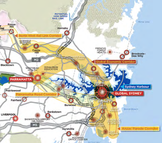
Cities and Corridors - Metropolitan Strategy for Sydney to 2031

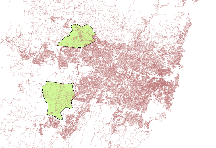
The Australian Bureau of Statistics collects data based on “mesh blocks”, or roughly an area containing roughly 50 dwellings. Last week I had some fun mapping the mesh blocks, as well as looking at Sydney’s urban densities. These mesh blocks are a good size to look at for calculating commute times.

The simplified process I used was this, for the technical minded:

  1. Calculate the centre of each mesh block
  2. Calculate the commute time via public transport from each block to every “centre” (using 131500’s GTFS and OpenTripPlanner’s Analyst tool)
  3. Import times in a database, calculate lowest commute time to each centre
  4. Visualise in TileMill
  5. Serve tiles in TileStache and visualise with Leaflet

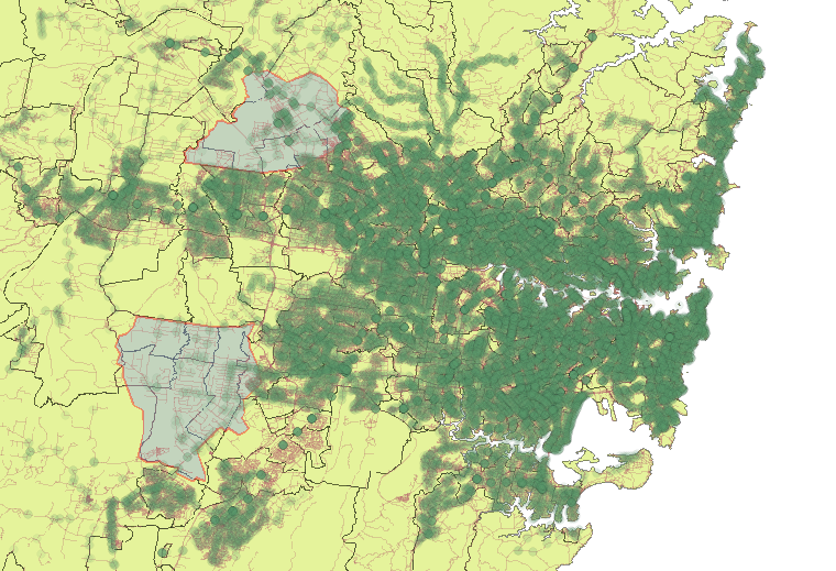
The first map I created was simply to indicate how long it would take to the nearest centre. There appears to be rapidly poorer accessibility on the fringe of Sydney. I was also surprised of what appears to be a belt of higher times between Wetherill Park and all the way to Marrickville. There also appears to be poorer accessibility in parts of Western Sydney. It is worth noting that I offer not guarantee of the integrity of the data in these maps, and I have seen a few spots where the commute times increase significantly in adjacent mesh blocks. This tells me the street data (from OpenStreetMap) might not be connected correctly.

My next map shows what areas are within 30 minutes.

These maps were both created using open data and open source tools, which I find quite neat.

I have been interested in mapping traffic for a number of years, maybe ever since arriving in Sydney. It is sort of a hobby; I find making maps relaxing. My first little map was way back in 2008, where I visualised speed from a GPS unit. A little later I added some colour to the visualisations, and then used this as an excuse to create a little GUI for driving speed. My interest in visualising individual vehicles has decreased recently, as it has now shifted to the mapping wider systems. Have an idea you would like to see mapped? Leave a note in the comments.

Sydney Commute Times Mapped Part 1

EDIT 12-03-2025: I accidentially broke the maps when deleting my AWS account, as the mbtiles were hosted there. Oops.

I quite like open data. I like data based on open standards (or mostly open standards) even better. Many transport operators around the world have started releasing their timetable data using (mostly) open standards, e.g. GTFS. One of the nice things about using a standard is that clever people have created tools to work with the timetable data, and those tools can now be used to manipulate timetable data from hundreds of agencies. The magnificent OpenTripPlanner is one such tool, and it works well with 131500’s GTFS data.

New South Wales Planning & Infrastructure have released a draft plan for how they hope to shape Sydney’s growth, which is where they detail the idea of a “city of cities”. I thought it would be interesting to mash these smaller “cities” with 131500’s transport data, and then display a map with the shortest commute to the nearest city. Various cities, I believe including Melbourne, have goals of re-achieving a “20-minute” city, or something similar (i.e. X% of the population can reach X% of the city within X minutes).

This map is the first stage. It only displays the commute time to St Leonards from every Mesh Block in the greater Sydney area. I used the open source tool OpenTripPlanner to computer the commute times, with OpenStreetMaps to support walking distances. The next map I release will probably have all the regional cities, and a similar styled map depicting time to nearest “centre”.

Visualizing Transport

I’ve had several conversations with neighbors and co-workers about the “lack” of forward thinking, or at least the lack of forward action. Of course, I keep in the back of my mind that we aren’t “experts”, and the more I learn about transport the more I learn how complex it is. Dr. Sussman’s CLIOS process (Complex, Large-
Scale, Integrated, Open Systems) appears more and more true the longer I work in and study transport. There is a plethora of excuses that can be made, but the general conclusion was that the earlier we prepare the better. I can remember working near Zhongshan 7-8 years ago and driving around on huge roads in the middle of empty fields. There weren’t even stoplights at every intersection. It was then that I had an epiphany of how smart the planning was to build the infrastructure before the masses arrived.

Sydney is estimated to increase by some 1.7 million people by 2036, and I can tell you, from a transportation (private and public) standpoint, that sort of scares me. When people ask me why transport is so difficult I justify it by with my uneducated guess that the CBD is next to the ocean, so everybody travels in from just 180 degrees instead of 360. Maybe this is why the NSW government created the “City of Cities” strategy. I realized this within the first few weeks: most people live west but work east.

Tonight (a Saturday) I was bored, and should have been studying, but wanted to create a few visualizations first.

The below maps were created using TDX data released from 131500. After converting it to GTFS I imported it into PostGIS using GTFSDB, and then could serve it via GeoServer. Finally, I could access it via WMS in QGIS. I added the stops into a map of Sydney and added some boundaries, and added the Growth Zones. The result was a map with every bus/train/ferry stop. Darker areas have stops that are closer (not necessarily more frequent service).

One of the first things I noticed is that there isn’t much physical infrastructure in these areas. There also aren’t many transit stops; I suppose this is why the South West Rail Link is going to be so important. I don’t know all of the political ramifications, but let’s hope the North West Rail Link is built as well?