Sydney's Education Levels Mapped

I was talking to a friend about what education levels might look like across Sydney, and a friend challenged me to map it.

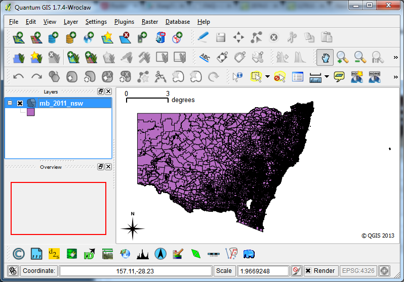
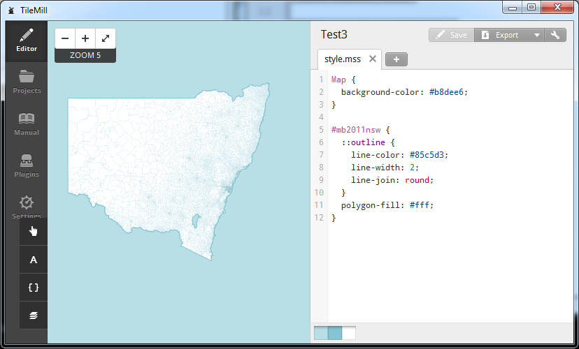
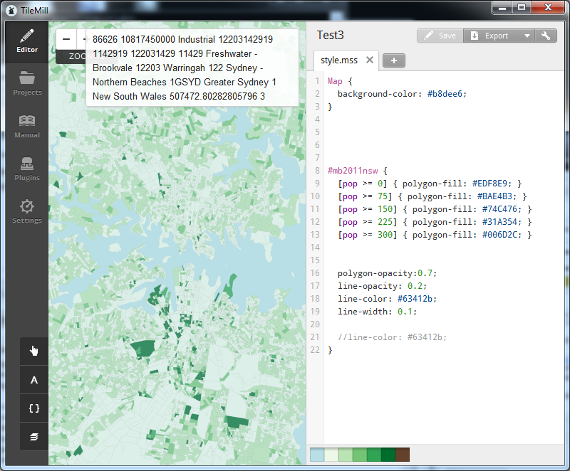
The map was derived by combining three datasets from the Australian Bureau of Statistics (ABS - a department releasing some great datasets). The first dataset was the spatial data for “SA2” level boundaries, the second the population data for various geographic areas, and the third from the 2011 Census on Non-School Qualification Level of Education (e.g. Certificates, Diplomas, Masters, Doctorates). I aggregated all people with bachelors or higher in an SA2 region, and then divided that number by the total number of people in that region. A different methodology could have been used.

EDIT: I should have paid more attention to mapping education levels. I mapped the percentage of overall population, but should have mapped the percentage of 25 to 34 year olds, as this would have aligned to various government metrics.

Reported education levels differ vastly by region, e.g. “North Sydney - Lavender Bay” (40%) vs. “Bidwell - Hebersham - Emerton” (3%). It is interesting to look at the different urban density levels of the areas, as well as the commute times to the nearest centre.

Without trying to sound too elitist, I was hoping to use this map to guide me where to consider moving (i.e. looking for a well educated, clean area with decent schools and frequent public transport). It was interesting to discover that the SA2 region I currently live in has the second highest percentage in NSW.

Sydney Commute Times Mapped Part 1

EDIT 12-03-2025: I accidentially broke the maps when deleting my AWS account, as the mbtiles were hosted there. Oops.

I quite like open data. I like data based on open standards (or mostly open standards) even better. Many transport operators around the world have started releasing their timetable data using (mostly) open standards, e.g. GTFS. One of the nice things about using a standard is that clever people have created tools to work with the timetable data, and those tools can now be used to manipulate timetable data from hundreds of agencies. The magnificent OpenTripPlanner is one such tool, and it works well with 131500’s GTFS data.

New South Wales Planning & Infrastructure have released a draft plan for how they hope to shape Sydney’s growth, which is where they detail the idea of a “city of cities”. I thought it would be interesting to mash these smaller “cities” with 131500’s transport data, and then display a map with the shortest commute to the nearest city. Various cities, I believe including Melbourne, have goals of re-achieving a “20-minute” city, or something similar (i.e. X% of the population can reach X% of the city within X minutes).

This map is the first stage. It only displays the commute time to St Leonards from every Mesh Block in the greater Sydney area. I used the open source tool OpenTripPlanner to computer the commute times, with OpenStreetMaps to support walking distances. The next map I release will probably have all the regional cities, and a similar styled map depicting time to nearest “centre”.

Mapping Mesh Blocks with TileMill

This quick tutorial will detail how to prepair the ABS Mesh Blocks to be used with MapBox’s TileMill. Beyond scope is how to install postgresql, postgis and TileMill. There is a lot of documentation how to do these tasks.

First, we create a database to import the shapefile and population data into:

Using ‘psql’ or ‘SQL Query’, create a new database:

CREATE DATABASE transport WITH TEMPLATE postgis20 OWNER postgres;
# Query returned successfully with no result in 5527 ms.

It is necessary to first import the Mesh Block spatial file using something like PostGIS Loader.

We then create a table to import the Mesh Block population data:

CREATE TABLE tmp_x (id character varying(11), Dwellings numeric, Persons_Usually_Resident numeric);

And then load the data:

COPY tmp_x FROM '/home/kelvinn/censuscounts_mb_2011_aust_good.csv' DELIMITERS ',' CSV HEADER;

It is possible to import the GIS information and view it in QGIS:

Now that we know the shapefile was imported correctly we can merge the population with spatial data. The following query is used to merge the datasets:

UPDATE mb_2011_nsw
SET    dwellings = tmp_x.dwellings FROM tmp_x
WHERE  mb_2011_nsw.mb_code11 = tmp_x.id;

UPDATE mb_2011_nsw
SET    pop = tmp_x.persons_usually_resident FROM tmp_x
WHERE  mb_2011_nsw.mb_code11 = tmp_x.id;

We can do a rough validation by using this query:

SELECT sum(pop) FROM mb_2011_nsw;

And we get 6916971, which is about right (ABS has the 2011 official NSW population of 7.21 million).

Finally, using TileMill, we can connect to the PostgGIS database and apply some themes to the map.

host=127.0.0.1 user=MyUsername password=MyPassword dbname=transport
(SELECT * from mb_2011_nsw JOIN westmead_health on mb_2011_nsw.mb_code11 = westmead_health.label) as mb

After generating the MBTiles file I pushed it to my little $15/year VPS and used TileStache to serve the tiles and UTFGrids. The TileStache configuration I am using looks something like this:

{
  "cache": {
    "class": "TileStache.Goodies.Caches.LimitedDisk.Cache",
    "kwargs": {
        "path": "/tmp/limited-cache",
        "limit": 16777216
    }
  },
  "layers": 
  {
    "NSWUrbanDensity":
    {
        "provider": {
            "name": "mbtiles",
            "tileset": "/home/user/mbtiles/NSWUrbanDensity.mbtiles"
        }
    },
    "NSWPopDensity":
    {
        "provider": {
            "name": "mbtiles",
            "tileset": "/home/user/mbtiles/NSWPopDensity.mbtiles"
        }
    }
  }
}

Mapping Urban Density in Sydney

EDIT 12-03-2025: I broke the maps when I deleted my AWS account, which I forgot as hosting the mbtiles.

Five years ago I started exploring different mapping technologies by detailing instructions on installing Mapnik and mod_tile. Times have changed significantly in the last five years, and thanks a lot to the products offered by MapBox. After playing with TileMill, MBTiles, Leaflet and UTFGrids, it is great how many annoyances have been fixed by MapBox. I find it enjoyable making maps now, as I no longer need to worry about patching code just to get it to run, or mucking about with oddities in web browser.

Each night this week I have created a new map using Mesh Block spatial data from the Australian Bureau of Statistics (Mesh Blocks are the smallest area used when conducting surveys). I am thankful to live in a country that provides a certain amount of open data, and the ABS should be applauded for the amount of data they provide. They provide spatial data about Mesh Blocks, as well as population counts for this spatial data. It is relatively easy to merge the two and then visualise them using TileMill.

First up - population density of Sydney, i.e. persons reported to be living in each mesh block. Darker red indicates a higher population count.

I find it interesting to see how many people live in certain Mesh Blocks. You will notice that Mesh Blocks with high population levels tend to be nearer public transport - either major roads with frequent bus service, or train stations.

We can look at the urban densities by determining dwellings per hectare, and do this per Mesh Block. The definition I used for urban densities comes from Ann Forsyth in “Measuring Density: Working Definitions for Residential Density and Building Intensity” (pdf). Ann discusses the need to consider net or gross densities, depending on the type of land use. At the Mesh Block level the land use type appears to be singular: Industrial, Parkland, Commercial, Residential, and Transport. Because the land use type was generally singular I have not adjusted to gross/net, but still used Ann’s definitions of certain density bands:

  • Very low density: 11 dw/ha
  • Low density: 11-22 dw/ha
  • Medium density: 23-45 dw/ha
  • High density: 45 dw/ha

“dw/ha” is dwellings per hectare. I decided to map the four density levels, which can be relatively easily achieved using TileMill. See below for an example.

You can zoom in and scroll over any Mesh Block in Sydney to find out more. Additional installation information on how I did this can be found on this special page: Mapping Mesh Block Data.

Fusion Tables and 131500 Stops

A short while ago I wrote about visualizing transport by using 131500’s TDX data, converted to GTFS, and served by GeoServer. Because I’ve started playing around with Google’s Fusion table, I thought it would be interesting to see what all the transit stops in Sydney look like in FT. So, voila!

Fun with OSM

I have to admit, to me, editing OpenStreetMap is actually a little therapeutic. Sort of like gardening.

My first major contribution was when I brought my little QStarz GPS unit across Indonesia, by train, sitting against the window.

The most recent contribution was our trip to Dubbo, where I helped fill in a few missing roads, and added an initial outlay of Dubbo Zoo.

If you have a GPS or have $60 to spend on one, and like anything CAD-drawing like, give editing OSM a try!

GPS Gem Find - TangoGPS

I’ve been looking for a simple, no-hassles GPS display program for Linux, and I believe I finally found one: TangoGPS. My requirements were quite simple; I needed something that would talk to gpsd, and display a dot on OpenStreetMaps. I’ve been able to do this in other programs (even in 3d in WorldWind), but I wanted something to download the maps for me, and GTK+ would be a plus.

TangoGPS was easy to install (apt-get install tangogps), and on my test ‘drive’ home tonight on the train, worked a treat. See related screenshots.

Charting the Hackers

A normal internet connection gets attacked, a lot. The majority of attacks are of the form “hello, anybody there?” – where most people just don’t answer. But sometimes, just sometimes, the question gets an answer. Depending on the answer, the attacker will start to explore.

A few weeks back I was a little bored and started fiddling. I wanted to play with my Cisco, but also wanted to play with OSSEC, but also has a GIS craving. In the end I decided to create a map of the people who ask, “hello”.

Take a look at the map and explanation if that sort of thing is your cup of tea.

Baby Steps at Graphing Traffic

Status: ✅

You can likely tell that I’ve been having some fun with graphing and mapping recently. I was reading a few articles about GIS and stumbled upon a pretty darn cool project at Webopticon, which included cool pictures. I showed it to a friend thinking they would find it interesting, and then realized: oh! KML has an altitude attribute. That could be interesting.
One of my projects is to create maps of Sydney’s traffic, so I have been experimenting heavily with Mapnik and OSM. I figured I could have some fun and finally parse some gps tracks and display the data.

I first started off trying to play around with the KML files my gps logger natively stores. After a while I realized it shouldn’t be this hard to parse the XML, and realized it also stores data in gpx format. I opened up one of the gpx files and immediately saw how much easier it would be to work with. I quickly created a parser for the xml in Python (using the dom method, yet I think I’m going to rewrite it using sax), and then with the aid of an article by Sean Gillies, converted the needed objects into KML. I used the speed attribute (with some magnification) as the altitude, and voila, a pretty picture.
This picture is as Victoria Road crosses James Rouse Drive – a spot that is always congested in the morning.
I’ll likely post some code shortly, I would like to rewrite the parsing section to use something event-driven – hopefully it will be a little faster.